
Bud On Tour
Bud On Tour is my passion project. Bud On Tour is a play on the words “Love On Tour,” Harry Styles’s most recent world tour. Bud On Tour is a branding project. The brand is applied to a line of cannabis products and promotional material, some of which are inspired by a handful of his songs. The brand identity is playful, incorporating retro styles and colors. It is in line with the Love on Tour branding, yet takes on an identity of its own. If Harry Styles launched a traveling cannabis experience, this is what I’d imagine it would look like.
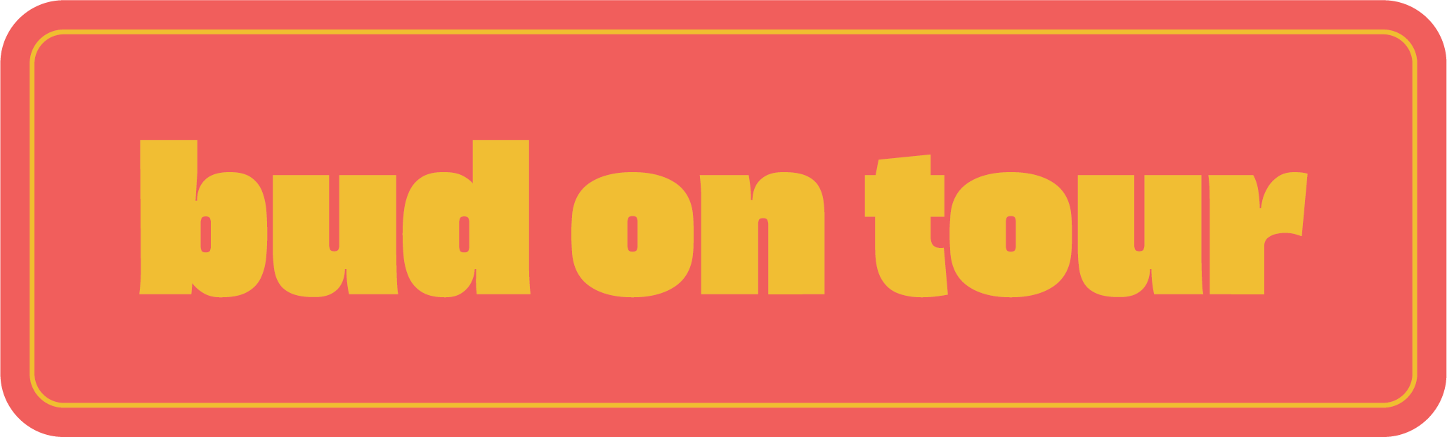
Bud On Tour Logos


Black and White Logos


Logo Variation

Color Palette

Branded Bags
Next, I created branded bags. The design for these was inspired by the logo, and meant to have the same feel.


Strain Specific Bags
Then, I created strain specific bags. I designed these bags around four different song titles: Late Night Talking, Music For A Sushi Restaurant, Daydreaming, and Two Ghosts. The “Two Ghosts” design was reused from another project I did early on in my college career.


Branded Pre-Roll Cones

Promotional Poster

Instagram Post

License Plate

More Berries Logo
Next, I designed the logo for “More Berries,” an edible line presented by “Bud On Tour.” I had the idea to make a spin-off edible brand because Harry Styles makes many fruit references throughout his discography. “More Berries” comes from the lyrics of hit single Watermelon Sugar: “I want more berries.” I thought these fruit-related songs would better align with edibles rather than flower. Having more than one brand is very common in the cannabis industry, as it allows one company to take up more of the market share.

Edible Bags
The four flavors of edibles are: Watermelon Sugar, Cherry, Kiwi, and Grape Juice. These are all titles from Harry’s discography.


