
Mylar Bags
The following images represent some of the projects that I got to work on at Custom Marijuana Packaging. At CMP, I designed packaging for cannabis products. The majority of what I worked on was mylar bags.
The High Company
This was one of the last projects I got to work on during my internship with CMP. The client needed designs for multiple strains, one of which being White Cherry Gelato. The High Company provided the logos present on the front and the back of the bag.


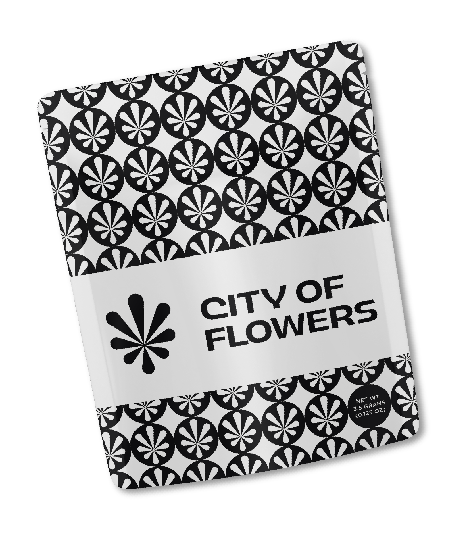
City of Flowers
I was given a few logos to work with to create a branded bag for City of Flowers. I used part of the logo to create a pattern for the background. The main logo sits in a rectangle of white space for legibility purposes. For the back of the bag, I went with a simple black background to act as a point of contrast to the busy design on the front. The state-required warning sits at the bottom of the bag within a rectangle to tie in the rectangle on the front of the bag. I chose to place the state-required net weight in one of the circles of the pattern.

Lush Greens
I was given a logo and some design direction to create a branded bag for Lush Greens. The client wanted a photorealistic image of a peacock on their bags, however I encouraged them to go the route of “peacock inspired” rather than literal peacock. I utilized the color palette present in the reference photo. Lush Greens provided a gradient logo, but I opted to simplify the logo to a light blue color.


Skunk House
The Skunk House team came to us with a logo and showed us a handful of images that they wanted to influence their packaging. They wanted to incorporate photographs. The client had an admiration for high-end art. They wanted their logo to look like there was splattered paint behind it. I allowed the strain name to inform the photographs.


Freshy Fine
Freshy Fine came to us with the need for edible packaging. They expressed the company’s shared love of the Grateful Dead, and wanted to include the Jerry Moon on their packaging. This was some-what fitting, given that the contents of the packaging was going to be night time gummies.


King Of Budz
When I returned to CMP after graduating, King of Budz decided to update change out their bags bi-monthly to provide their customers with different packaging every so often. Little to no design direction was provided. Below are two of my favorite designs that I created for KOB. The first was created when the client asked for a Detroit inspired bag. I incorporated a map of Detroit’s streets as well as the city’s official color palette. As for the second bag, the client wanted to feature the Detroit skyline. I wanted the scene to resemble the skyline during sunset, with the city’s reflection shown in the Detroit river.


